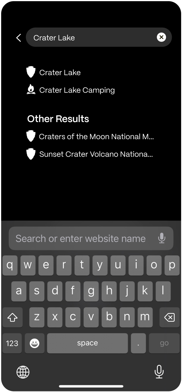
Designing the anticipation and adventurous nature of National Park trip planning
My Role
Product Design, Brand
Timeline
4 weeks
Team Members
Stephanie, Mike, Steve
The Problem
The national parks inspire adventure, but a fragmented trip planning flow made it harder to turn that inspiration into a visit
How Might We
Encourage potential park visitors to plan and visit the
national parks while providing clear informational guides?
My Contribution
I researched and designed the trip planning flow and the app's branded experience
From park inspiration to a vivid, seamless trip planning experience
EXPLORE
Find parks,
adventures,
and news
BEGIN
Your next
adventure
with the
perfect plan
LOCATE
Destinations, Activities, Map Modes
The Current app
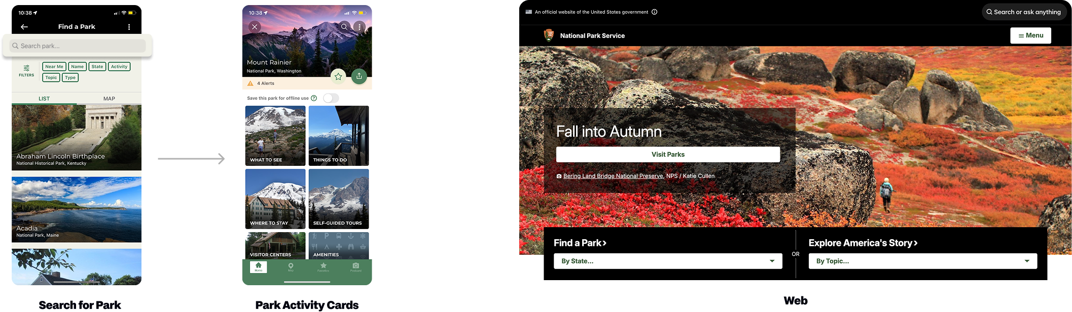
Park discovery takes priority in the app, while fragmented trip planning across the website creates barriers to visiting
Requires navigating six pages for park discovery and 8 browser tabs to navigate trip itinerary like weather, trail, etc
Competitive analysis
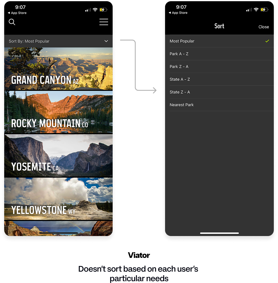
Existing trip planning solutions have mental model mismatches and poor discoverability
Sorting is too broad to support different visitor needs
Solution: Organize options around visitor goals & preferences
Current progression from A → B: planned trip has too much overhead
Solution: Bring essential trip information into a more cohesive flow
Info Architecture & Emotional Mapping
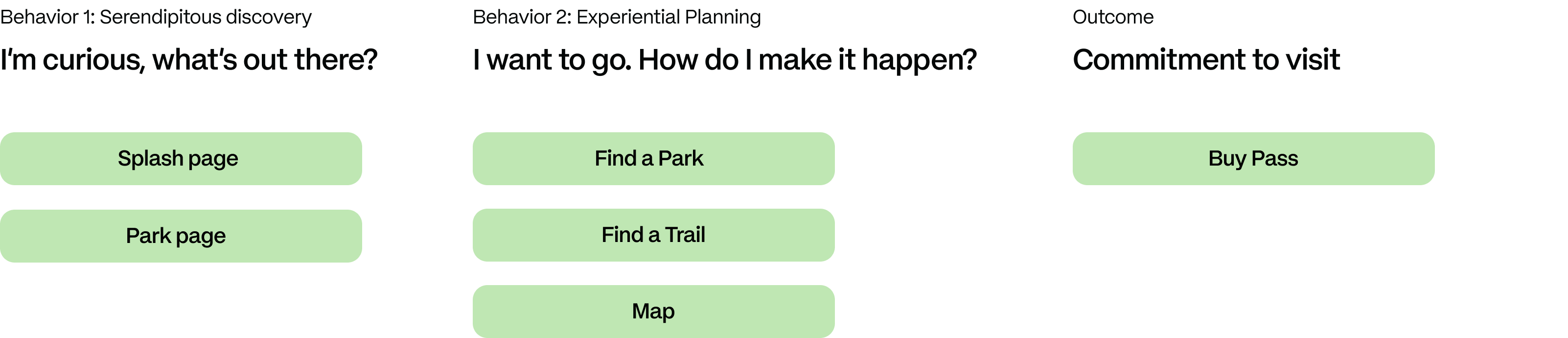
Revealed the natural hierarchy of trip planning through user
interviews and autoethnographies
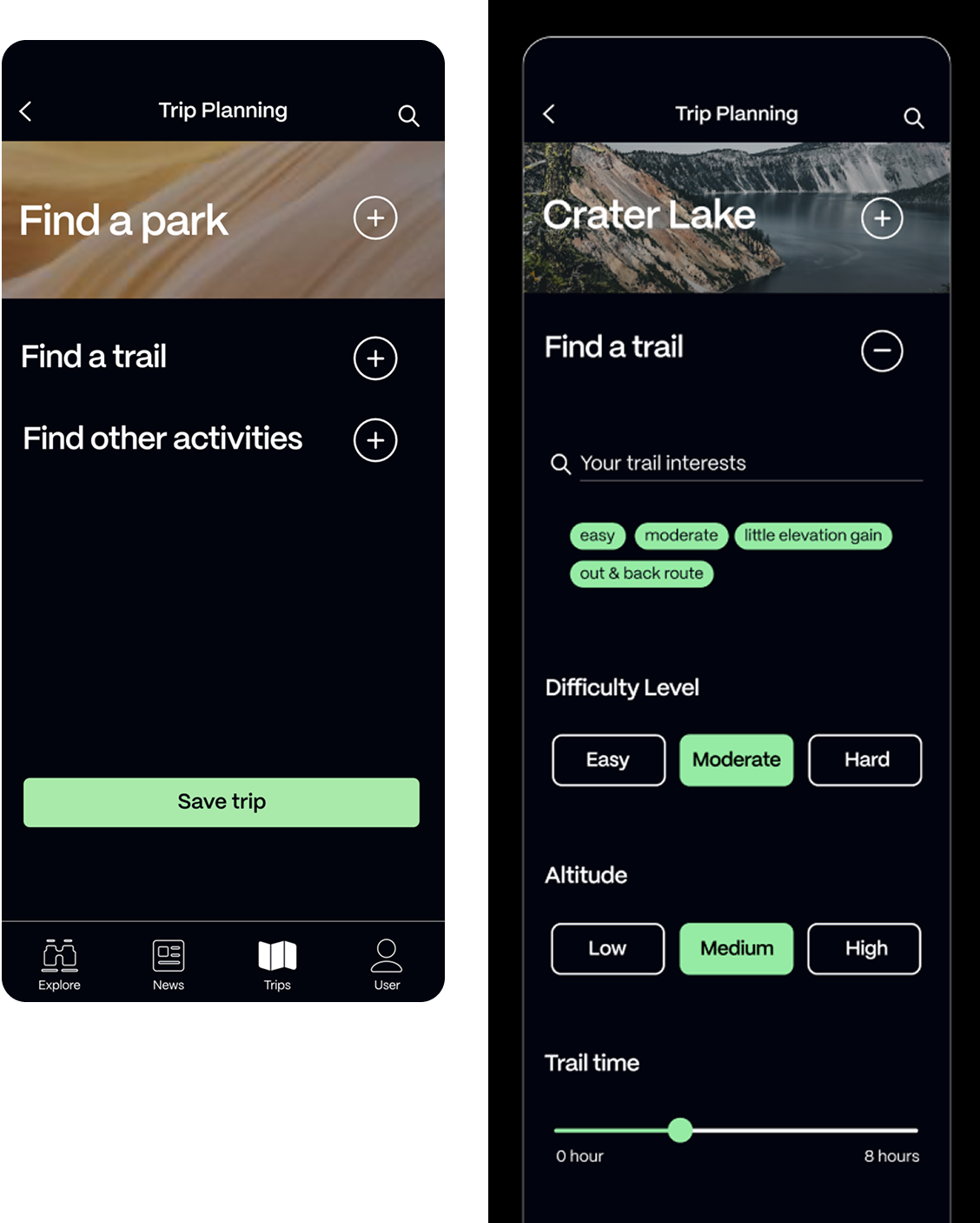
I distilled the park discover feature & 8 browser tabs into one concise accordion experience
Created visual affordances to key decisions made to keep the trip planning motivating, focused, and solve the low visibility accordions can cause
Sorted NPS’s large library into a tagging system so users can customize their results
Based these metrics off of secondary competitorTrailFinder
I identified the overlooked joys of the outdoors that make the digital journey motivating
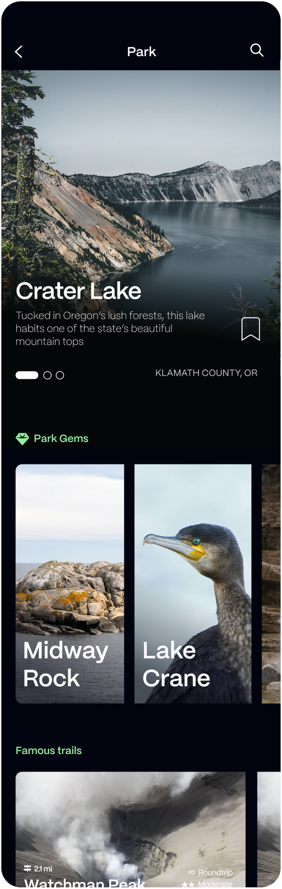
Discovering
Hidden Gems
After visiting Olympic national
park, I realized that hidden gems
are an underlying motivator to
get people to visit the parks.
Therefore I oriented it second on
the park page
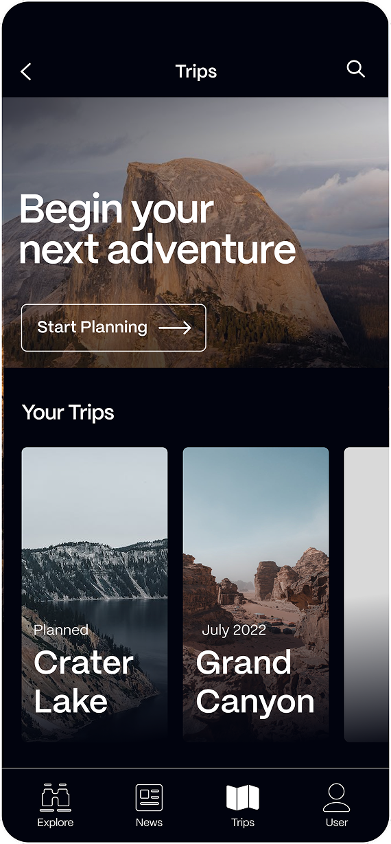
Collecting
trip experiences
People often save trails for repeat
trips, collect brochures, mugs,
and refrigerator magnets of parks.
The trips page could be another place
to start a new trip and collect
trip experiences
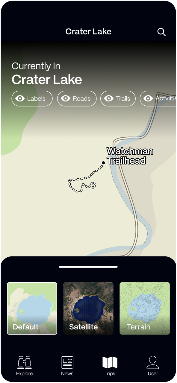
I prioritized clarity and intentional location of the parks map to only appear when relevant
A clear title of what you’re viewing
A list of labels to toggle different park features on/off
3 clear map modes to view different kinds of maps
Branding
I designed the screens to be credible and fresh, prioritizing the iconic, natural beauty of National Parks and the simplicity of the trip planning experience
Crafted
Adventurous
Fresh
Credible
Calm
Design Language
I designed a system that engages potential park visitors with
an informative user experience that uses dark backgrounds to
bring forth the soft, modest colors of the natural world
Moving Forward
Expand on Buying Passes
I want users to be able to buy their passes
within the app instead of navigating to their
web browsers. That way passes are more
accessible to users
Create Events
Currently our app explores trip planning,
park, trail, editorial, map, profile, and home
page however NPS also offers park events