An unofficial National parks services app redesign to prompt discovery and adventure for possible park visitors
My Role
Researcher, UX Strategist, UX Designer & UI designer
Timeline
4 weeks
Team Members
Stephanie Chuong, Steve Wu, Mike Wa
The Problem
The current National Parks App lacks intuitive user flows, brand identity, and effective product strategy
How Might We
Encourage potential park visitors to plan and visit the national parks while providing clear informational guides?
My Contribution
As one of the main UI Designers and UX Strategists, I created the rebrand, screen compositions, and crafted new user flows
Competitive Analysis
Many existing solutions lack clean UI and an intuitive user flow that promotes park discoverability and visitation
Playground Buddy
Local park finder
Viator
Tours & Activities
Park trial finder
National park trails
Research Findings
Insights were gathered via autoethnographies and meaningful interviews with regular park visitors
Information hierarchy is disorganized
The current app has confusing, inconsistent UI that prevents the user from finding what they are looking for and ending up lost
Planning a trip takes ages
Currently it takes up to eight browser tabs and over an hour of scoping to find the right park, trail, possible events, and itinerary required before visiting
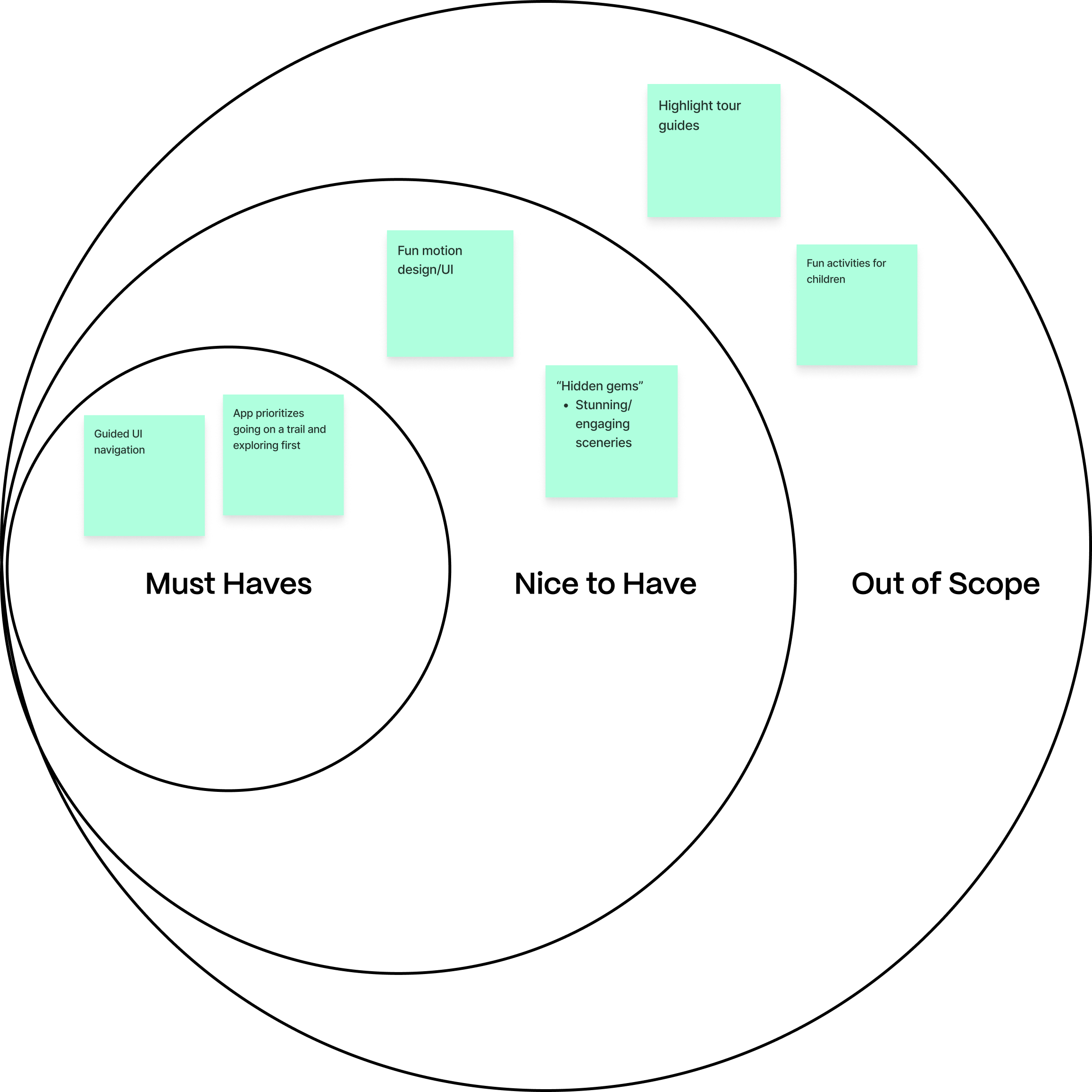
Hidden gems are often concealed
Other than imagery it is difficult to comprehend what makes a national park stand out. Once a hidden gem is found it can be even more difficult locating it within a park
UX Strategy
Organizes, simplifies, and unifies the system
The application should have straightforward navigation and clear, compact informational guides
Provokes a sense of adventure
Has awe inspiriting media and highlights notable points of interest
Facilitates community engagement
Has enjoyable media, engaging UX writing, and motion design
Feature Selection
Prioritized features that enhanced the user experience and fit our customer goals
Design Explorations
Produced concept cards to have open discussions about the general flows, hierarchy of information, and look and feel of the mobile application
Splash Page
Introduce the spirit of the national parks with fun facts as the app is opened to peak curiosity for the user
Trip Planning
Help the user choose the right park and trail for them that suits their itinerary
Home
Prompt learning about the parks by showing parks, trails, and articles with engaging media
Introducing our NPS Redesign that streamlines the trip planning process
EXPLORE
Find parks, adventures, and news
BEGIN
Your next adventure with the perfect plan
LOCATE
Destinations,
Activities,
Map Modes
READ
News on widlife, events, and park updates
Individual Screens
I designed the screens to be credible and fresh, prioritizing the iconic, natural beauty of National Parks and the simplicity of the trip planning experience
UI Moodboard
Collected a select series of images that reflected a sense of natural beauty, adventure, and ease
Crafted
Adventurous
Fresh
Credible
Calm
Design Language
I designed a system that engages potential park visitors with an informative user experience that uses dark backgrounds to bring forth the soft, modest colors of the natural world
Moving Forward
Expand on Buying Passes
I want users to be able to buy their passes within the app instead of navigating to their web browsers. That way passes are more accessible to users
Create Events
Currently our app explores trip planning, park, trail, editorial, map, profile, and home page however NPS also offers park events